[eng]
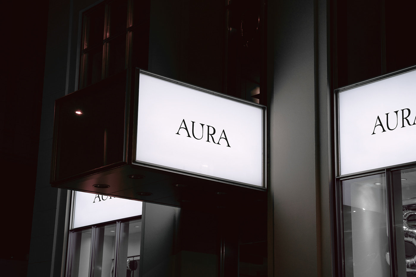
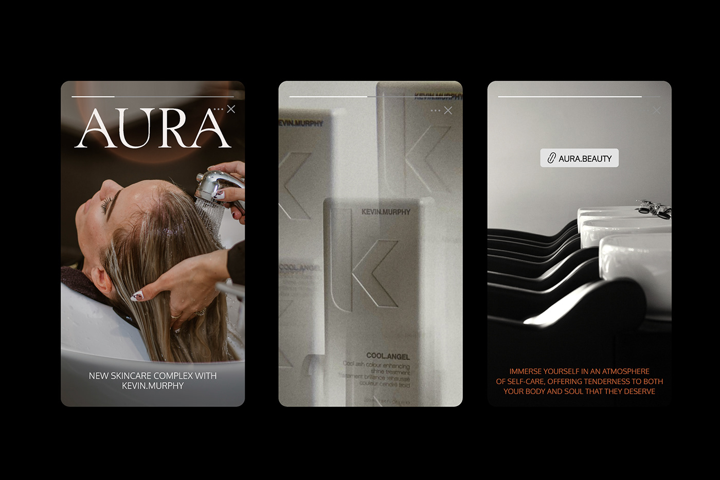
AURA, as a beauty salon, is a place where beauty is regarded as art. The salon's interior design and ambiance create a cozy and stylish space, inspiring clients. The salon always stays abreast of the latest trends and offers innovative procedures and technologies in skincare. A personalized approach to each client is emphasized.
In esoteric and metaphysical traditions, an aura is often described as a unique energy field surrounding a person. In everyday language, the term "aura" is also used to describe a special atmosphere, feeling, or impression created by a place, event, or personality.
This understanding inspired the creation of a distinctive element in the form of a gradient circle, illustrating the concept of a radiating aura and visualizing light and positive energy. This graphic design is easily recognizable across various mediums, from business cards to social media. The chosen font underscores style and elegance, with the circle symbol evident in each letter, creating unity and reinforcing the overall concepts of aura and light. Orange, as the brand color, symbolizes energy and optimism, serving as one of the primary colors associated with the aura. Additionally, this color choice highlights the unique atmosphere conveyed by this location.
[rus]
AURA, как салон красоты, представляет собой место, где красота рассматривается как искусство. Дизайн интерьера и атмосфера салона создают уютное и стильное пространство, вдохновляя клиентов. Салон всегда следит за последними тенденциями и предлагает инновационные процедуры и технологии в уходе за внешностью. Подчеркивается персонализированный подход к каждому клиенту.
В эзотерической и метафизической традиции аура часто описывается как своеобразное энергетическое поле, окружающее человека. В обыденной речи термин "аура" также используется для описания особенной атмосферы, чувства или впечатления, создаваемого каким-то местом, событием или личностью.
Эти знания подтолкнули на создание фирменного элемента в виде градиентного круга, который иллюстрирует идею расходящейся ауры, визуализируя свет и положительную энергию. Такой графический прием легко узнаваем на различных носителях - от визиток до социальных сетей. Выбранный шрифт подчеркивает стиль и элегантность. Символ круга прослеживается в каждой букве, который создает единость, усиливая общую идею ауры и света. Оранжевый, как фирменный цвет, символизирует энергию и оптимизм, являясь одним из основных цветов ауры. Кроме того данное цветовое решение подчеркивает особую атмосферу, которую транслирует данная локация.